
Design Strategy

11 Web Design Rules to Build a Site People Will Actually Love

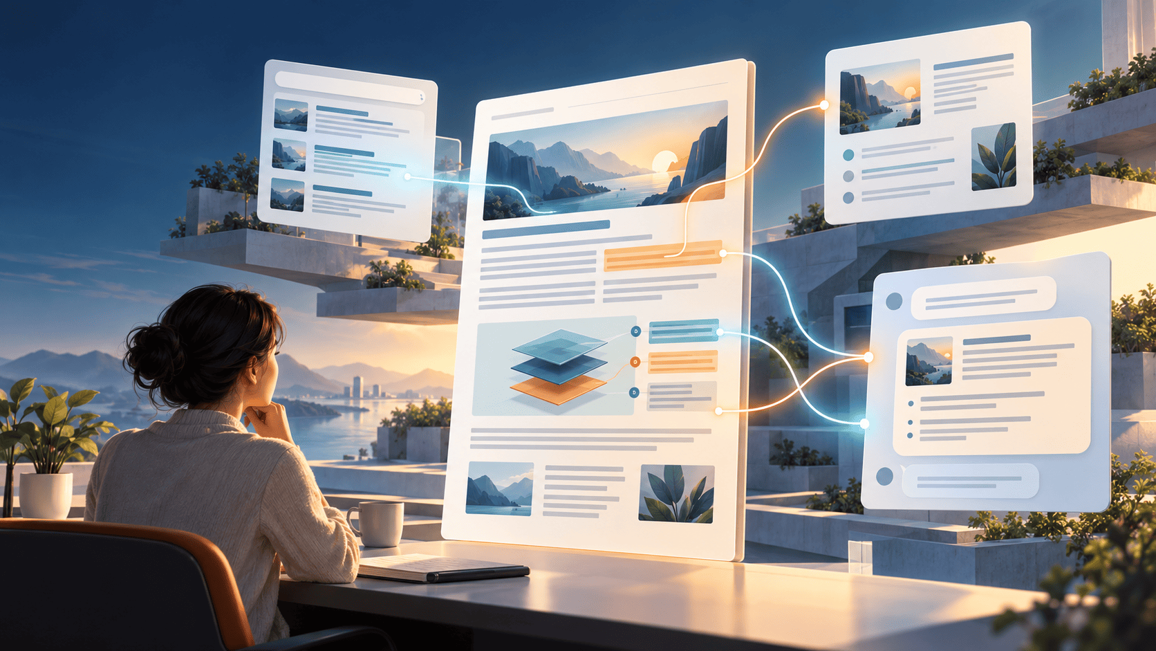
We’ve all heard “rules are meant to be broken,” but when it comes to web design, ignoring the basics can send your visitors running. The right design principles—shaped around your unique business and your audience—help you create a site where users can actually get things done. Here are 11 tried-and-true rules to guide you.

1. Start with a crystal-clear purpose.
Before you even think about colors or layouts, ask yourself: “What’s the one thing this website needs to help users do?” Let that answer drive every single decision. A fashion boutique needs stunning, fast-loading visuals; a research blog needs scannable, well-organized information. Design around your “why,” and the rest falls into place.

2. Know your users like you know your best friend.
Your site isn’t for you—it’s for them. Build simple user personas to imagine who you’re designing for. If you already have a site, ask real visitors for feedback through quick surveys or feedback widgets. Their honest input will tell you exactly what’s working and what’s making them leave.

3. Create a journey so smooth they don’t even notice it.
No one likes feeling lost. Build intuitive menus and clear pathways so visitors move from one step to the next without frustration. Make your calls-to-action (CTAs) bold and unmistakable—buttons that practically say, “Click me, you’re almost there.”

4. Keep it refreshingly simple.
Clutter kills focus. Stick to a harmonious color palette and just one or two fonts. Every single element on the page should earn its place; if it doesn’t help your user, let it go. A clean design lets people concentrate on what actually matters.

5. Stay consistent—everywhere.
Your site should feel like one seamless story. Use the same colors, fonts, and layout patterns across all pages. Blog posts should follow a uniform format. For online stores, product photos should share the same background and lighting. Consistency builds trust and makes browsing effortless.

6. Guide their eyes with visual hierarchy.
Lead users to the most important stuff first. Make your main headline big and bold, and give CTAs a contrasting color so they pop. Ask yourself, “Where do I want them to click?” Then make that button impossible to miss.

7. Serve up content that’s actually worth reading.
Beautiful design is empty without meaningful content. Write helpful, well-researched material that shows you know your stuff. And don’t forget to link between your pages—point blog readers toward relevant services. It helps users dig deeper and gives your search rankings a gentle boost.

8. Design for every screen, big and small.
With almost everyone browsing on their phone, mobile design isn’t optional. Make sure your site loads fast, text is readable, buttons are thumb-friendly, and navigation feels natural on a tiny screen. Test on real devices and watch session recordings to catch any hiccups.

9. Welcome everyone with open arms.
Accessibility is a must. Add descriptive alt text to images, make sure everything works with a keyboard, ensure strong color contrast, and optimize for screen readers. Use inclusive language and diverse imagery so all visitors feel seen and comfortable.

10. Test, learn, and tweak—forever.
Launching your site is just the starting line. Use heatmaps, session replays, and surveys to see what people actually do. Find out where they click, where they stall, and what annoys them. Then keep polishing. A site that never evolves eventually becomes stale.

11. Don’t be a copycat—be unmistakably you.
It’s fine to gather inspiration, but let your brand’s personality shine. What works for a competitor’s audience might flop for yours. Before you jump on a trend like infinite scroll, ask your users if it genuinely makes their experience better. Practical design wins over gimmicks every time.

So, when is it okay to break the rules?
Sometimes what your audience loves flies in the face of conventional advice. If they adore a busy, information-packed page, give it to them. If different color schemes for different sections help them navigate, go for it. The rules you should never break are the ones rooted in user experience: clarity of purpose, deep understanding of your audience, and a smooth, inclusive journey for everyone.

Remember, a “pretty” design doesn’t guarantee success. Plenty of successful, profitable websites are downright plain—because they nail structure, navigation, and user intent. Keep your visitors at the center of every decision, and your site will earn their loyalty.

Comments (3)

  1. The point about consistency is so obvious yet so often overlooked. I’ve left online stores simply because the product images looked completely different from one page to the next—it erodes trust instantly.

  2. I love the honesty in rule #10. A website is never truly finished, and regular testing with heatmaps or quick surveys feels much more manageable than huge redesigns. Starting small with user feedback this week.

  3. Rule #4 really hit home—I’m definitely guilty of crowding my pages. The idea that every element must “earn its place” is a simple but powerful filter I’ll apply from now on.

Leave a comment

Your email address will not be published. Required fields are marked *