

Google Ads Banner Sizes: What Actually Works in 2026
The Google Display Network is massive—over 2 million sites and apps, reaching almost everyone online. But here’s the catch: your ad only gets a chance to appear if the shape of your banner actually fits the hole the website has available. Upload the wrong dimensions, and you’re not even in the running. The AffRoom team put this together to show you exactly which Google display ad sizes actually matter, what the tech specs are, and which ones you should actually spend time making.
(About AffRoom: It’s a directory where you can find vetted affiliate marketing companies, read honest reviews, and talk directly to network reps.)
What Sizes Are Actually Out There?
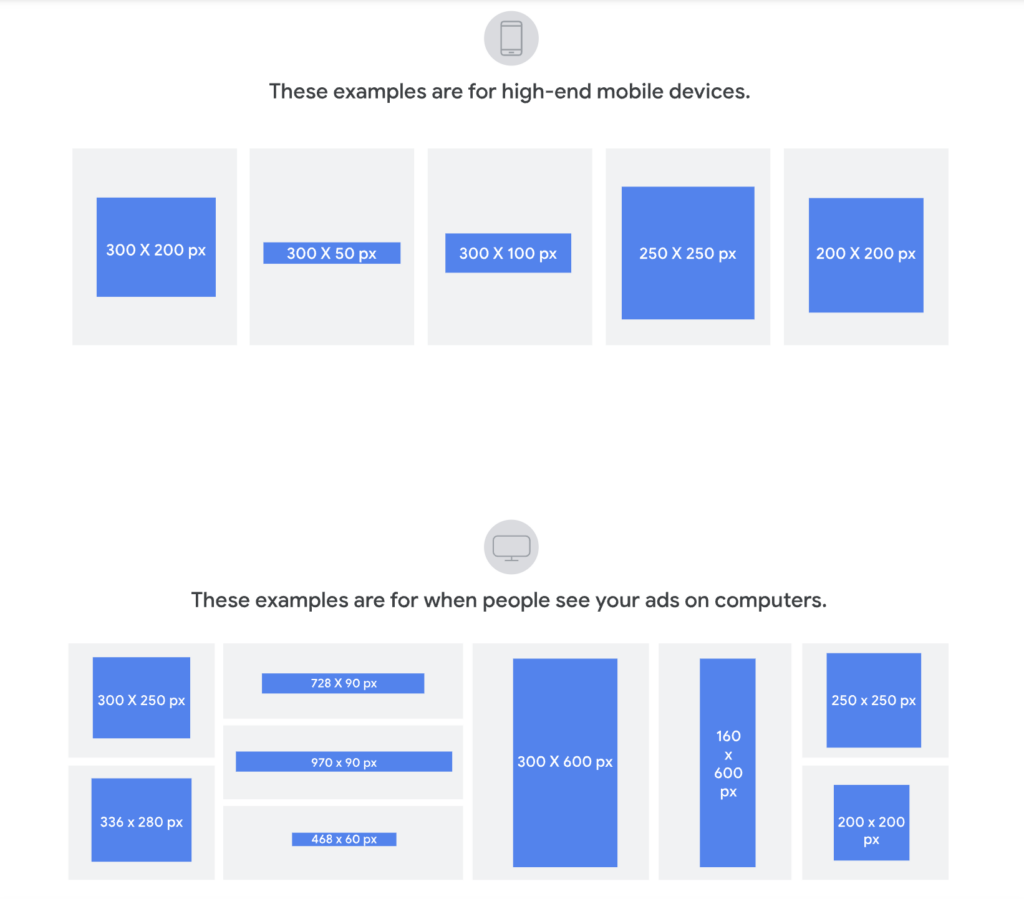
Google says they support tons of sizes. In reality? About 9 or 10 formats eat up 99% of the ad space on the internet. The rest are either ghost towns left over from old websites or just don’t exist in real life. Making an ad in a dead format is just setting money on fire.
Here’s the cheat sheet of the ones that actually get traffic:
| Size | Name | Device | What It’s For |
|---|---|---|---|
| 300×250 | Medium Rectangle | Desktop / Mobile | The Swiss Army knife. Fits everywhere: sidebars, inside articles. Highest supply, but highest competition. |
| 728×90 | Leaderboard | Desktop | The classic billboard at the top of a news article. Good for getting seen, bad for getting clicks. |
| 160×600 | Wide Skyscraper | Desktop | That tall, skinny ad that follows you down the side of a webpage. |
| 336×280 | Large Rectangle | Desktop | Just a bigger, bolder version of the 300×250 inside content. |
| 300×600 | Half Page | Desktop | The big, premium sidebar unit. Less common, more expensive, but impossible to ignore. |
| 320×50 | Mobile Banner | Mobile | The standard bar stuck to the bottom of your phone screen. Cheap volume. |
| 320×100 | Large Mobile Banner | Mobile | Twice the height of the standard mobile bar. Actually gives you room for a button and a logo. |
| 970×90 | Large Leaderboard | Desktop | Super wide header. Only on fancy/premium sites. |
| 970×250 | Billboard | Desktop | Another big header format. Don’t spend much time here unless you’re running big brand campaigns. |
| 468×60 | Banner | Desktop | The dinosaur. Used to be standard, now it’s basically extinct. Skip it. |
Which Ones Actually Work Best?
Three sizes rule the internet: 300×250, 728×90, and 300×600. But “common” doesn’t always mean “good for your wallet.”
- 300×250: It’s the workhorse, but the rent is high (CPM). You’re fighting with everyone else for attention.
- 728×90: Great for getting your logo seen (awareness). Terrible for getting a click because it’s a long, skinny strip with no room for a good button.
- 300×600: This is the premium real estate. High visibility, but not every site has this spot available.
- Mobile (320×50 vs 320×100): The small one is just for cheap reach. The taller one (320×100) is the sleeper hit—it gives you enough space to actually sell something without a huge price jump.
The “Will My Ad Get Rejected?” Checklist
Google doesn’t just reject ads for being naughty; they reject them for being technically wrong. Here’s how to avoid the auto-reject bot:
- File Type: JPG, PNG, GIF (or HTML5 zipped up). No Flash—that’s 2007 technology.
- File Size: Keep it under 150 KB. Don’t upload a massive raw PNG. Compress it.
- Animation: Animated GIFs cannot run longer than 30 seconds. If they loop forever, they have to stop after 3 loops.
- Quality: Upload the exact pixel size. Don’t stretch a small image to fit a big box—it looks blurry and gets rejected.
- Text Area: The 20% Rule. If more than 20% of your image is covered by text or a logo, Google’s robot might slap a rejection notice on it.
How to Pick Sizes Without Overthinking It
This isn’t a graphic design choice; it’s a math problem based on where your customers are.
- Check Your Traffic: If 60%+ of your visitors are on phones, 320×100 is mandatory. Desktop heavy? Stick to 300×250 and 728×90 as your base.
- Know Your Goal: Want attention? Go big (300×600). Want clicks and cheap traffic? Go standard (300×250 and 320×100).
- Know Your Sites: Cheap, long-tail blogs usually only take 300×250 and 728×90. Fancy news sites take the bigger 300×600 and 970×90. Design for the lowest common denominator first.
How to Test Sizes Without Wasting Cash
Don’t just guess. But test smart:
- Compare Fairly: Run Google’s auto-ads (Responsive Display Ads) and your own custom static banners at the same time. Not one after the other.
- Change One Thing at a Time: Don’t change the size and the image in the same test. You won’t know which change caused the result.
- Be Patient: Give it at least a week and 1,000 impressions per size before you judge it.
- Distrust the Algorithm: Google will always recommend you use their automated Responsive Ads. That’s easier for them. It’s not always better for your specific campaign.
Bottom Line
The sizes you pick decide where you can play. The network you join decides how well you get paid. If you’re looking for good partners to run these banners with, AffRoom is a vetted catalog of ad networks and affiliate programs where you can filter by what you actually need and talk to managers directly.
Thank you so much for being honest about “dinosaurs” like 468×60 and other “supported but dead” formats. Many beginners (and even experienced teams) believe the official Google documentation, which states, “We support 427 banner sizes.” In reality, 99% of the inventory consists of just 9 formats, while the rest are either technical ghosts or spots with a CPM of 3 cents and a 0.01% CTR. A question based on your experience: is there any way to “revive” traffic on non-standard sizes for specific niches? For example, if I’m advertising B2B software for lawyers, and legal portals suddenly have a lot of 250×250 inventory (which isn’t on your list). Is it worth taking the risk and designing for these rare formats, or is it better to always scale down to 300×250 and hope Google adapts it?
A special mention goes to highlighting the 320×100 as a “sleeping hit.” The experience of many affiliate marketers confirms that the difference in CTR between 320×50 and 320×100 can be two to three times greater, because it’s difficult to fit even readable text and a button into a small banner. And the CPM increase is often only +10–20%, which makes 320×100 more cost-effective. A question about mobile layout: do these banners fall under “responsive compression” by publishers? Sometimes you order a 320×100, but the publisher’s site physically displays it as 320×85, cropping the edges or distorting the proportions. How do you recommend checking the actual display on partners’ sites before launching a campaign? Are there blacklists of bad ad networks where they “resize” everything indiscriminately?
Google’s “20% text” rule is a classic headache for marketing designers. You want to include a logo (5%), a headline (5%), a CTA button (5%), and a discount percentage (5%)—and that’s it, you’re already at 20%; any random spot pushes you into the red zone. A question about life hacks: how do you technically recommend getting around this restriction in 2026 (legally, without cheating)? For example, does Google analyze text based on image rendering or metadata? Is it possible to “weave” text into the background pattern so that the algorithm doesn’t recognize it, but a person can read it? Or has Google gotten smarter after all, and is it better to simply design with minimal text + strong visuals, trusting the algorithm to extract the context from the landing page on its own?